


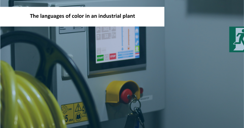
What does red mean in a factory? It can stop a machine, identify fire-fighting equipment, or mark a container for rejected parts. Same color, three different messages. One misinterpretation is enough to remind us that, in an industrial plant, color is not decoration.
Understanding the meaning of colors in a factory may seem simple until several codes share the same space. Industrial safety signage provides part of the answer, but location, shape, process, risk assessment, and each plant’s standards also play a role. A familiar color may be communicating something very different from what we assume.
At Esypro, we see this, for example, in the hooks used on our overhead conveyors. In many projects, they are painted yellow to make their movement more visible; in others, the customer requests them in red to comply with the plant’s internal standards. Neither decision can be interpreted without context.
So, how should color really be interpreted in an industrial plant? To answer this question, we need to stop looking for a universal color code and start distinguishing between the different visual languages that coexist within a factory.
The five languages of color in an industrial plant
There is no universal classification encompassing every use of color in industry. To structure the analysis, this article proposes grouping them into five languages:
| Language | What it communicates | Examples |
|---|---|---|
| Safety and emergency | Hazards, prohibitions, mandatory actions, and evacuation routes | Signs, warning stripes, emergency stops, and fire-fighting equipment |
| Operational status and control | What is happening, what requires attention, and what action should be taken | Push buttons, signal towers, Andon systems, HMIs, and pick-to-light systems |
| Flow and spatial organization | Where people, parts, and vehicles should move, and where each element belongs | Aisles, designated areas, locations, and AGV and AMR routes |
| Technical identification | What an element is, what it contains, or which system it belongs to | Electrical conductors, terminals, pipes, energy sources, and isolation points |
| Environment and well-being | Visual comfort and perception of space | Walls, general finishes, and break area |
This classification is not intended to turn the five languages into separate categories, but to organize the uses of color according to their primary function. In practice, they may overlap: on an AGV, signal lights communicate its status or a maneuver, while floor markings organize its route; an Andon system provides operational information but may also trigger a logistics action. A single system can speak several languages at once, provided that each element retains a clear meaning.
Safety and emergency: the language of prevention
Industrial safety signage is probably the most recognizable color language in a factory. Much of its vocabulary is shared internationally, although each regulatory framework conveys these messages somewhat differently. ISO 3864-1 establishes safety colors and design principles, while ISO 7010 standardizes many of the safety signs and symbols in use.
In Europe: color, shape, and symbol
In the European Union, Directive 92/58/CEE, implemented in Spain through Real Decreto 485/1997, assigns the following general functions to colors:
| Color | Primary meaning |
|---|---|
| Red | Prohibition, danger or alarm, stop, and fire-fighting equipment |
| Yellow or amber | Warning, attention, and caution |
| Blue | Mandatory action or required behavior |
| Green | Emergency escape, first aid, and safe conditions |
These associations are familiar to us because we encounter them in everyday life, for example, on road signs. In an industrial plant, however, meaning does not depend on color alone.
Color is combined with shape and a symbol: a yellow triangle indicates a warning, a circle with a red border and diagonal line indicates prohibition, a blue circle indicates a mandatory action, and a green square or rectangle identifies emergency escape or first-aid information. Fire-fighting equipment, meanwhile, is identified by red square or rectangular signs.
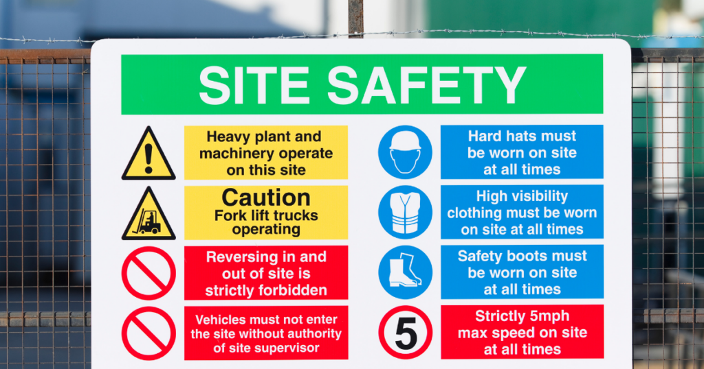
Each element provides a clue. The color places the message within a category, the shape indicates the type of sign, and the symbol specifies the hazard, prohibition, or required action.
In the United States: color, text, and severity level
In the United States, the basic vocabulary is not radically different. OSHA regulations also use red for danger, emergency stops, and fire-fighting equipment, and yellow for caution and physical hazards.
The difference becomes clearer in how warnings are presented and prioritized. OSHA defines sign categories such as Danger, Caution, and Safety Instruction, in which text plays an explicit role. The ANSI Z535 series also includes Warning and associates words and colors with different levels of severity: red for Danger, orange for Warning, and yellow for Caution.
This does not mean that Europe does without text or that the United States does not use symbols. The color vocabulary is similar, but the emphasis used to construct the message differs. Therefore, in an international facility, recognizing the colors is not enough: the applicable regulations and each plant’s standards must also be checked.
Signage is not protection
In any country, there is one fundamental limitation: identifying a hazard does not mean that it has been controlled. Marking a pinch point helps people recognize it, but it does not prevent access or contact. That requires guards, interlocked doors, safety scanners, or other technical and organizational measures.
Safety signage complements these measures; it does not replace them. Color can warn of a risk, but it cannot eliminate it.
Operational status and control: when color informs and guides
In safety signage, the message usually remains fixed. With operational indicators, however, the visual signal changes according to the status of the system. It may confirm that equipment is operating normally, draw attention to an abnormal condition, or indicate where an intervention is required.
IEC 60073 establishes general principles for coding indicators and actuators, while IEC 60204-1 contains requirements applicable to the electrical equipment of machines. Within this framework, red is generally associated with an emergency, yellow with an abnormal condition, green with a normal condition, and blue with a required action. These conventions provide a starting point, but the specific function of each indicator must be defined, applied consistently, and documented within the project.
The meaning also depends on the type of device being used. A signal tower makes it possible to identify the status of a piece of equipment from a distance. An Andon system makes production, quality, maintenance, or supply issues visible to facilitate a response. In a pick-to-light system, light serves a different purpose: it guides the operator to the correct location or item and may support the work sequence. In this case, the position of the illuminated module may be more important than the color itself.
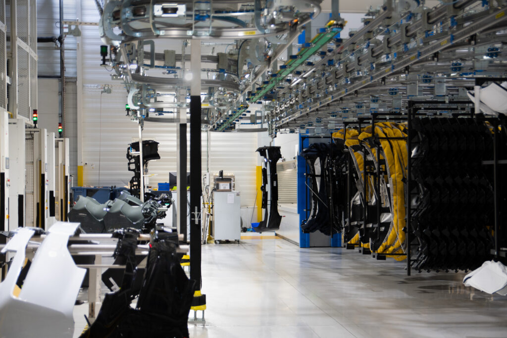
Therefore, the same color does not always convey the same instruction. A red Andon light may indicate that a production line has stopped, but it is not equivalent to an emergency stop. Similarly, a green signal light may confirm that a piece of equipment is operating normally, but it does not, by itself, authorize access to a safeguarded area. Safe access depends on safety functions, interlocks, and the control of hazardous energy.
Do you need greater control over your operations?
We design solutions that make every process visible and manageable.
HMIs and operator displays: color as a visual hierarchy
When operational information is concentrated in a human-machine interface (HMI), color no longer functions as an isolated signal but becomes part of a visual hierarchy. It can help users identify areas, equipment, routes, groups of elements, and operating states at a glance. An HMI may be displayed on a touchscreen panel, an industrial computer, or a tablet: the device may change, but what matters is how the information is organized and presented.
The ANSI/ISA-101.01-2015 standard provides a framework for designing consistent interfaces focused on operator needs. Among other aspects, it addresses display hierarchy, navigation, graphics, the use of color, and alarm representation.
Using many colors is not necessarily a problem. A broad palette can make complex systems easier to interpret, provided that it follows a clear logic and is applied consistently. Normal states may be represented using color, but abnormal conditions and alarms must retain sufficient contrast to be identified quickly.
The message should not depend solely on the ability to distinguish a particular color. Text, symbols, shapes, and contextual data help users understand what has happened, where it has occurred, and its level of priority. Similarly, a color should not change meaning between displays without a justified reason.
When we think of an industrial HMI, many of us picture a screen with a gray background. At first glance, this may appear to reflect a lack of design, but it usually serves a functional purpose: a neutral background reduces visual noise and allows operating states, alarms, and relevant elements to stand out clearly. It is not the only option, but it illustrates the principle behind an effective HMI: the design is not intended to draw attention to itself, but to direct it toward the information that matters.
Flow and spatial organization: the floor as a map of the plant
In an industrial plant, color also helps people find their way around. Colored lines and surfaces indicate where to move, where materials should be placed, and which spaces must remain clear. The floor thus becomes a visual map that separates pedestrian and vehicle traffic, defines loading areas, identifies container locations, and marks the perimeter of machines and equipment.
Industrial floor markings are not based solely on internal criteria. In the European Union, Directive 92/58/EEC establishes that, when necessary to protect workers, vehicle traffic routes must be clearly identified by continuous stripes in a clearly visible color, preferably white or yellow, taking the color of the floor into account. In the United States, OSHA requires permanent aisles and passageways to be appropriately marked, although it does not establish a general color code either.
Regulations require routes and boundaries to be clearly visible, but allow each organization to develop its own system. In many industrial plants, it is common to find:
- White for aisles, locations, and general boundaries.
- Yellow for traffic routes, boundaries, or areas requiring caution.
- Green for accepted products or areas associated with a safe condition.
- Red for rejected products, scrap, or areas that must remain clear.
- Blue for materials, process stages, or other internally defined categories.
These uses are common, but not universal. Red may identify rejected products in one plant and mark an area that must remain free of obstacles in another. The color code must therefore be documented, compatible with safety signage, and applied consistently throughout the facility. Its usefulness depends less on the particular colors selected than on ensuring that everyone interprets them in the same way.
Fixed routes, dynamic zones, and shared spaces
Floor markings should represent the facility’s predictable movements. For an AGV following a fixed route, the path itself is marked. When routes vary, as they do with many AMRs, it is more useful to define operating zones, crossings, transfer points, and waiting or charging areas.
These markings organize the space shared by people, forklifts, and other mobile equipment, while vehicle lights communicate their status or provide warning of a maneuver. Both systems must be coordinated without confusing their respective functions.
The visual map must also be updated whenever the layout changes. Outdated routes, partial repairs, and the accumulation of different codes can eventually turn a useful aid into a source of confusion.
Technical identification: what it is, what it contains, or which system it belongs to
The fourth language of color neither warns of an abnormal condition nor organizes traffic: it identifies. It helps users recognize an electrical conductor, determine what a pipe carries, or distinguish which circuit, energy source, or system an element belongs to. It is used on cables, terminals, pipes, circuits, and isolation points.
Here, color rarely works alone. It forms part of a code completed by letters, numbers, labels, symbols, or consistent positioning. Its meaning must be defined in standards, diagrams, and documentation rather than relying on intuition or on how things were done at another plant.
Wiring and pipes: clear and unambiguous identification
In electrical installations, IEC 60445 establishes general rules for identifying terminals and conductors using colors or alphanumeric notation. The purpose is not to decorate the wiring but to prevent ambiguity and support safe operation. The code used must comply with the applicable standard and remain consistent across diagrams, markings, and documentation.
A similar principle applies to pipes. ISO 20560-1:2024 addresses safety information concerning their contents and associated hazards. Color can support initial recognition, but labels, text, symbols, and directional arrows provide information that a color alone cannot convey.
Orange clearly illustrates why context is essential. Under the ANSI system, it may warn of certain exposed hazardous parts of a machine; in an electric vehicle, UN Regulation No. 100 uses it to identify certain high-voltage cables. The color may be the same, but in the first case it belongs to the language of safety and, in the second, to that of technical identification.
Environment, well-being, and identity: color beyond signage
After warning, informing, guiding, and identifying, color still performs a less obvious function. It also shapes the atmosphere of an industrial plant and influences how the space is perceived.
This fifth language is the least regulated of the five. There is no simple relationship between color and meaning. Instead, decisions are based on visual ergonomics, workplace well-being, and accessibility. For this very reason, it is also the area in which evidence, trends, and industrial myths are most easily mixed.
Reseda green: the color that defined an industrial era
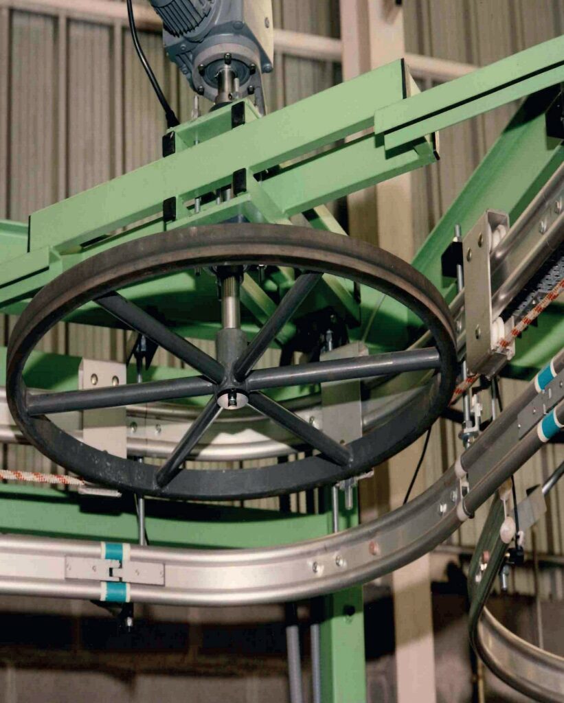
Some colors can immediately place a machine within a particular period. The grayish green found on many old lathes, milling machines, and drill presses is one of them. This is RAL 6011 reseda green, a shade particularly associated with European machinery from the middle decades of the 20th century.
The former German DIN 1844 standard specified RAL 6011 as a color for machinery. Its use in Germany’s highly export-oriented industrial sector helped this particular green become a familiar feature of workshops in many other countries.
This legacy can also be found in Esypro’s history. Some of our earliest overhead conveyors, manufactured in the late 1980s, featured a shade very close to the reseda green characteristic of industrial machinery at the time.
Numerous benefits have been attributed to reseda green: being easy on the eyes, supporting concentration, helping to prevent accidents, and concealing oil and dirt more effectively. Some of these explanations are plausible and may have influenced its selection, but they do not demonstrate that RAL 6011 alone reduces fatigue or accidents.
Its history remains valuable for a different reason. It shows how an earlier era sought to combine standardization, maintenance, and visual comfort long before user experience became a common consideration in industrial environments.
Color psychology in the workplace
Color psychology has popularized several easy-to-remember ideas: blue improves productivity, green reduces stress, and yellow stimulates creativity. However, research does not support such simple or universal associations.
The influence of a color depends on its hue, saturation, and brightness, as well as on lighting, contrast, the surface area it covers, the surrounding colors, the type of task, and the duration of exposure. Personal and cultural factors, such as age, visual abilities, and learned associations, also play a role.
For this reason, it is more useful to discuss visual and cognitive ergonomics in an industrial plant. Color can establish hierarchies, support orientation, differentiate areas, reduce visual noise, and help users locate relevant information. It can also help make a break area perceptually distinct from the production floor.
However, a green wall cannot compensate for poor lighting, excessive noise, or a poorly designed workstation. Color can contribute to workplace well-being, but it never works alone.
Color blindness in industry: why color cannot be the only signal
Visual cues allow a signal tower, an alarm, or the status of a machine to be interpreted quickly, but not everyone perceives color in the same way. Color vision variations, commonly referred to as color blindness, can make certain shades difficult to distinguish. Perception may also change with age or be affected by certain illnesses, injuries, and medications.
In an industrial plant, these variations can affect the interpretation of signs, labels, displays, and indicator lights. Critical information should therefore not depend solely on distinguishing, for example, between red and green. Color can be combined with shapes, symbols, text, alphanumeric codes, consistent positioning, or clearly differentiated levels of contrast. When required by the risk assessment, visual signals can also be supplemented by audible warnings or other signals perceived through different senses.
A simple test is to ask whether the message would still be understood if the color were removed. If an alarm, display, or label loses its meaning, it needs a second cue. Inclusive industrial signage does not dispense with color: it uses it as reinforcement without relying on it to convey all the information.
An industrial plant that communicates clearly
The five languages of color do not exist in isolation. Within the same plant, safety, equipment status and operation, flows and spatial organization, technical identification, and the influence of color on the working environment all coexist. Each serves a different purpose, but all of them must be integrated into a single visual system, without contradictions or ambiguous messages.
Color in industrial environments acts as an interface between the facility and its people: it warns, informs, guides, identifies, and also influences how the space is perceived. Its effectiveness does not depend on applying a universal formula, but on following a clear hierarchy:
- First, eliminate or reduce the risk.
- Next, comply with legal requirements and technical standards.
- Then, adapt to the customer’s standards and the plant’s own codes.
- Finally, use color to improve understanding and visual comfort and, where possible, reinforce identity without interfering with the previous functions.
This consistency is essential in any industrial project. A system must not only perform its intended function but also integrate into the plant’s visual framework so that its equipment, signs, and spaces can be interpreted easily and without contradictions.
Because the right color is not always red, yellow, green, or blue. It is the one that communicates the right information to the right person at the right time.
“Blau macht glücklich”
In 1997, Volkswagen accompanied the blue illumination of the Golf IV with a phrase that is difficult to forget: Blau macht glücklich. Blue makes you happy. At Esypro, we could not agree more.
We are always pleased to see our blue move from the logo into a real installation, although it must coexist with each plant’s safety, operational, and identification codes. In an industrial environment, no color speaks for itself: its meaning depends on its function, context, and the visual system to which it belongs.
Standards provide the grammar, each plant develops its vocabulary, and every installation finds its own accent.
Looking for an overhead conveyor tailored to your plant?
We analyze your process and design the right material handling solution.
Color in industrial plants: Frequently Asked Questions
There is no single universal code covering every use of color in an industrial plant. Safety signage is governed by specific standards and regulations, while the colors used to identify processes, materials, operating states, or logistics areas may depend on each company’s internal standards. Any color code should therefore be documented and applied consistently.
Their meaning depends on the context. In European safety signage, red is associated with prohibition, danger, stopping, and fire-fighting equipment; yellow indicates a warning; blue indicates a mandatory action; and green identifies emergency escape, first aid, or a safe condition. The same colors may serve different purposes in operational indicators, pipes, wiring, or logistics.
The main international references include ISO 3864-1, which covers safety colors and design principles for safety signs, and ISO 7010, which standardizes numerous safety symbols. Directive 92/58/EEC also applies in the European Union. In the United States, relevant references include OSHA regulations and the ANSI Z535 series. The applicable requirements depend on the country, facility, and type of sign.
The main international references include ISO 3864-1, which covers safety colors and design principles for safety signs, and ISO 7010, which standardizes numerous safety symbols. Directive 92/58/EEC also applies in the European Union. In the United States, relevant references include OSHA regulations and the ANSI Z535 series. The applicable requirements depend on the country, facility, and type of sign.
Not always. Both frameworks share basic associations, such as red with danger and yellow with caution, but they construct and prioritize messages differently. In Europe, the combination of color, shape, and symbol is particularly important. In the United States, text and signal words such as Danger, Warning, and Caution play a more prominent role.
There is no universal color palette for all industrial floors. White and yellow are frequently used to define aisles, routes, and work areas, while other colors may identify materials, locations, or product status. The selected colors should comply with applicable requirements, provide sufficient contrast with the floor, and be documented in an internal color-coding system.
Yes. It can contribute to visual comfort, orientation, and the perception of space, but it does not replace safety measures or support attributing universal effects to any particular color.
Critical information should not depend on color alone. It can be reinforced using shapes, symbols, text, alphanumeric codes, consistent positioning, and clearly differentiated levels of contrast. A simple test is to check whether the message remains understandable when color is removed. If it no longer makes sense, it needs an additional visual or sensory cue.
Yes. It can contribute to visual comfort, orientation, and the perception of space, but it does not replace safety measures or support attributing universal effects to any particular color.
Critical information should not depend on color alone. It can be reinforced using shapes, symbols, text, alphanumeric codes, consistent positioning, and clearly differentiated levels of contrast. A simple test is to check whether the message remains understandable when color is removed. If it no longer makes sense, it needs an additional visual or sensory cue.
Critical information should not depend on color alone. It can be reinforced using shapes, symbols, text, alphanumeric codes, consistent positioning, and clearly differentiated levels of contrast. A simple test is to check whether the message remains understandable when color is removed. If it no longer makes sense, it needs an additional visual or sensory cue.